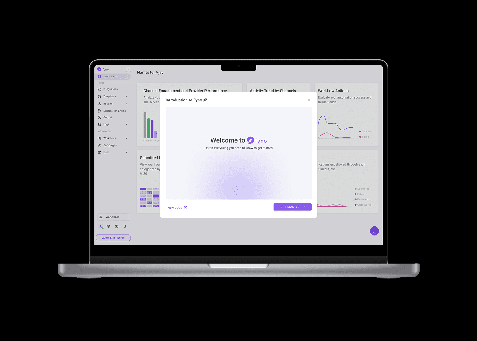
As Fyno evolved from MVP to growth-stage product, we saw growing user demand for more visibility and accountability around notification performance. The need for more than just logs was evident—they wanted to understand the story behind their notification traffic. The raw data was available, but the tools to make sense of it were missing. Our users — spanning developers, marketers, and product teams wanted context: which channels worked best, where things failed, and how to optimize future sends.
Role
Lead Product Designer — Designed, tested, and launched Fyno’s first analytics dashboard, working closely with backend and customer success teams.
For
Fyno - https://fyno.io/analytics
Year
2023
Challenge
How might we transform raw system data into a useful, intuitive dashboard that caters to both technical and business users?
Approach
We anchored our approach in support tickets and user interviews. These revealed frustration around debugging failed notifications, identifying underperforming channels, and tracking notification events over time. We discovered that what users really needed was:
A high-level summary of overall system health
The ability to investigate spikes in failures
A way to report outcomes to non-technical stakeholders
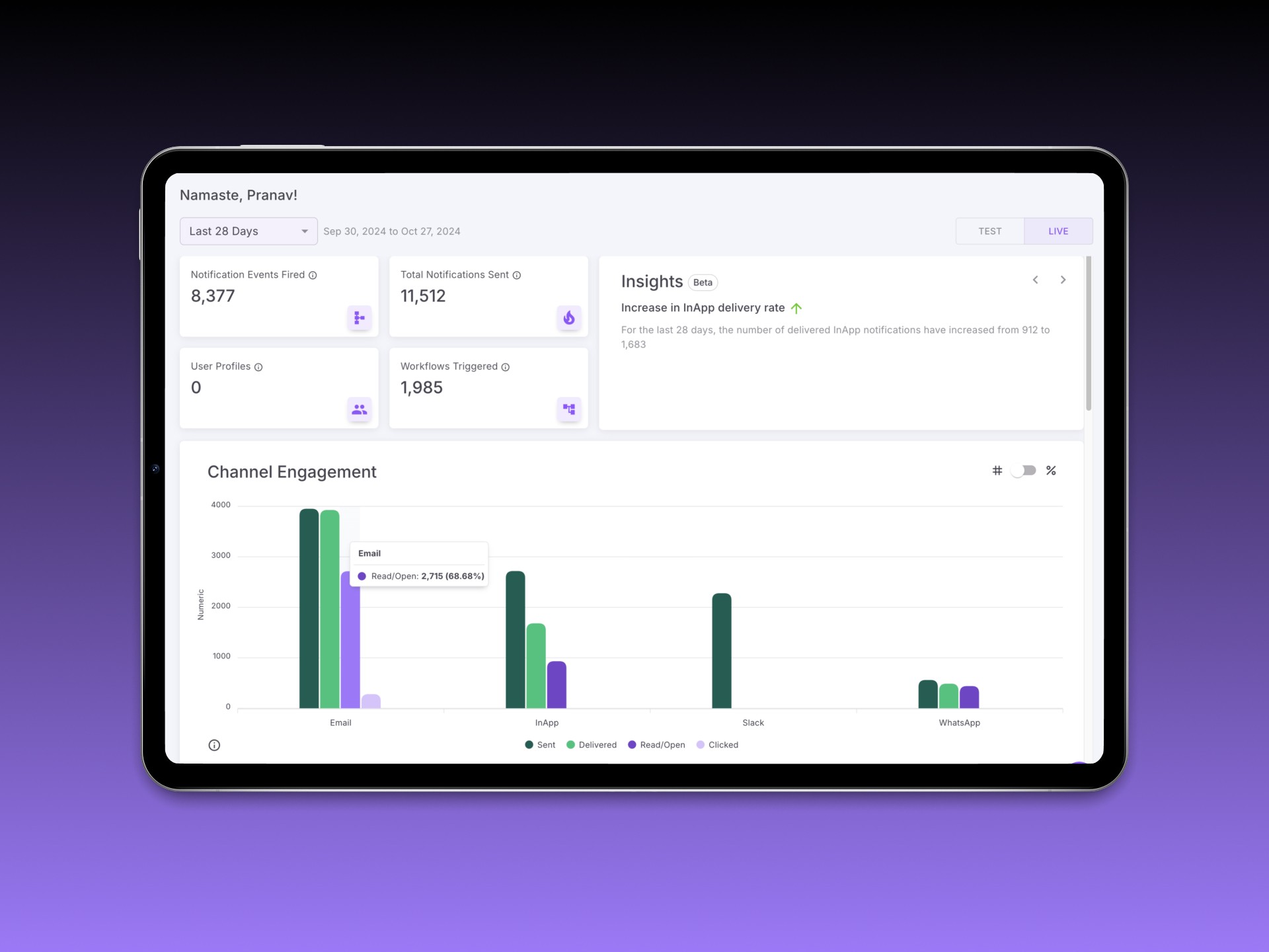
We grouped metrics into 3 key clusters: Volume, Success/Failure Rate, and Retry Patterns.


Process
Instead of a single monolithic chart, we broke the dashboard down into actionable modules:
Overview Cards — Summarized total events, success rates, and triggered automations
Channel Engagement — Bar chart showing comparative usage and traction by channel
Delivery Status Timeline — Line graph depicting success, failure, undelivered, and error states over time
Provider Performance — Benchmark of integrated notification providers
Notification Trends — Based on time (AM/PM) and day (weekday/weekend)
Event Insights — Top-performing events based on delivery volume
Automation Insights — Actionable triggers and their impact
Empty States — Designed to prevent confusion when filters return no data
AI-Powered Insights — Contextual prompts explaining key drops or spikes
We used filters (Today, Yesterday, Last 7/28 Days, Custom) across modules to allow time-based exploration.

Outcome
We rolled out the dashboard incrementally, starting with a pilot group of five customers. Using a split-test format, we compared legacy log access vs. the new analytics view, tracking engagement via Mixpanel and internal feedback loops.
Paired usability tests helped us validate the mental model behind the ‘Percentage vs. Numerics’ toggle. Participants appreciated the ability to quickly diagnose issues without needing to comb through individual event logs.
Post-launch metrics:
Feature usage increased by 3x in the first 6 weeks
70% of users reported “better clarity” in understanding delivery issues
Customer Success team reported 40% fewer interpretation-based queries within the first month
One customer even adopted the dashboard’s framework for internal reporting templates
Takeaways
This project showed me the power of narrative framing in data UX. People don’t just need charts — they need meaning. My biggest learning was in designing defaults that scale: when you can’t assume what users are looking for, design something worth discovering.
Future Scope
We scoped out potential next steps including:
Smart alerts based on delivery anomalies
Trend summaries sent weekly
Custom report downloads for team reporting
More granular filters by environment, region, or provider clusters