Fyno is a notification infrastructure platform that allows businesses to orchestrate, manage, and monitor messages across multiple channels and providers. Unlike its competitors—who offer one slice of the notification stack—Fyno is an all-in-one ecosystem. That meant the product was powerful, but unfamiliar. Onboarding became a bottleneck. We didn’t prioritize onboarding until the MVP was stable—but by then, user drop-offs and internal hand-holding made it clear we had to design an onboarding flow that didn't just show features, but made sense of the product itself.
Role
Product Designer (with mentorship support). Led research, flows, and UI/UX decisions for the onboarding revamp. Mentored a design intern during exploratory stages
For
Fyno
Year
2024
Challenge
How might we onboard users into a brand-new category of tool—one they haven’t seen before—and still make them feel at ease?
Fyno needed an onboarding experience that:
Explained why it existed, not just how to use it
Adapted to the user’s role (dev vs. business)
Reduced support dependency during activation
Approach
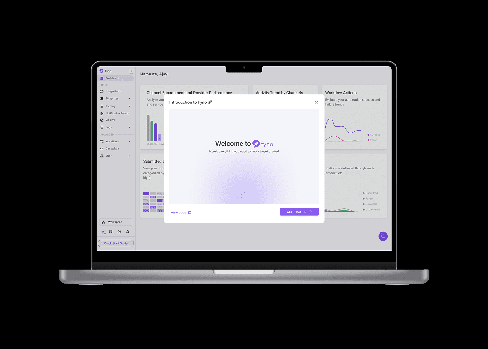
We started with temporary scaffolding. Since onboarding wasn’t a priority during the early build phase, I designed quick “What’s New” modules that popped up as users navigated the tool. These helped explain UI changes and new feature rollouts with minimal effort.
Meanwhile, I mentored a design intern and asked them to explore competitor onboarding styles. The exercise was useful—but since Fyno’s scope was unique, we realized we couldn’t borrow common onboarding patterns and call it done.
Process
Once the core product features were stable, I led the end-to-end onboarding redesign.
Key design decisions:
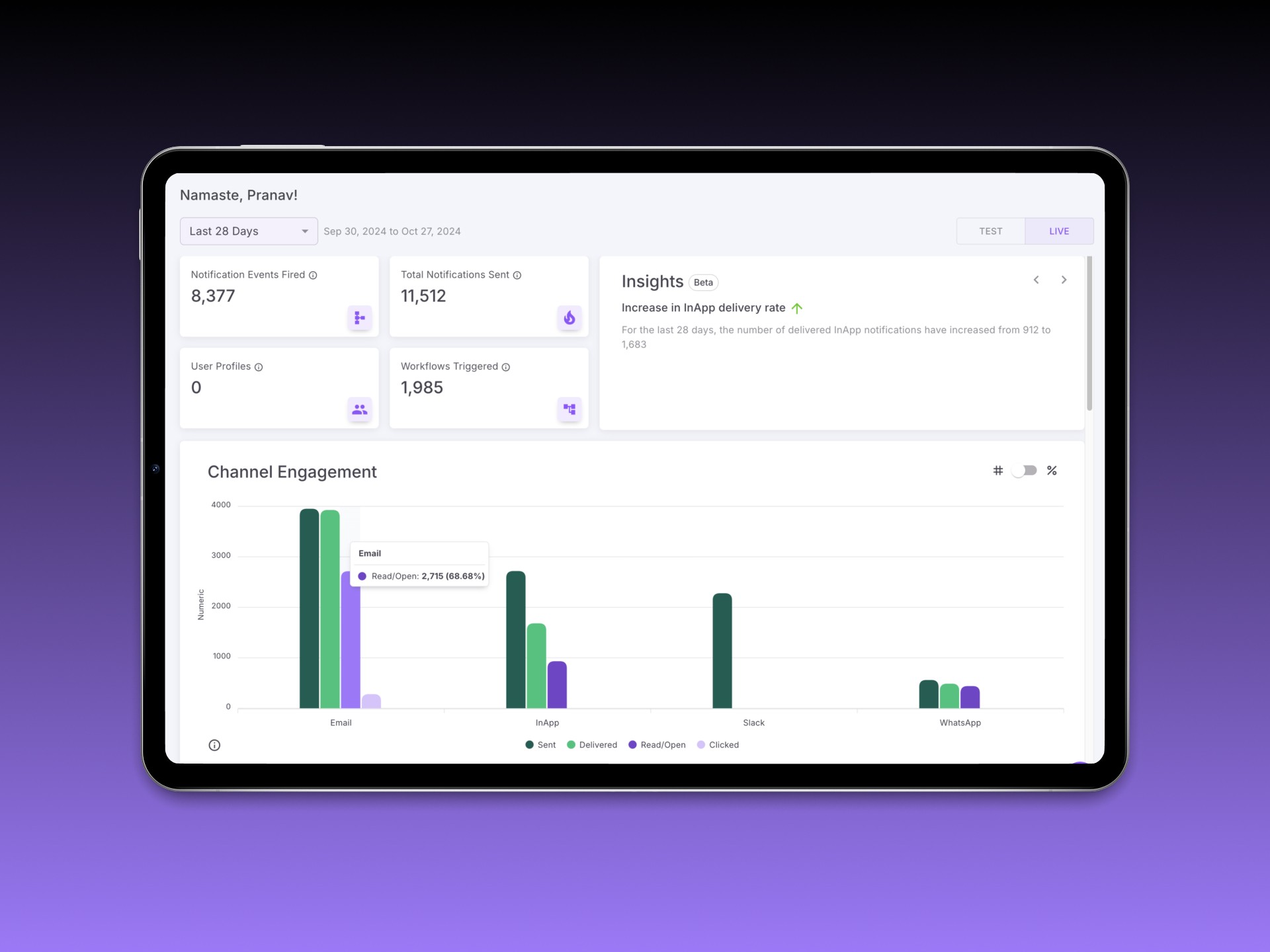
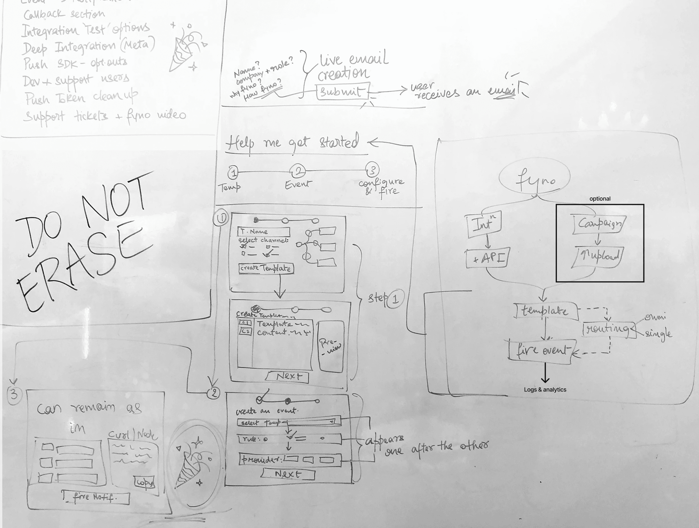
We built a Quick Start Guide anchored on 4 core steps:
Connect a Provider (e.g. email, SMS, push)
Design a Template for that channel
Create an Event that combines provider + template
Trigger a Notification to test the system
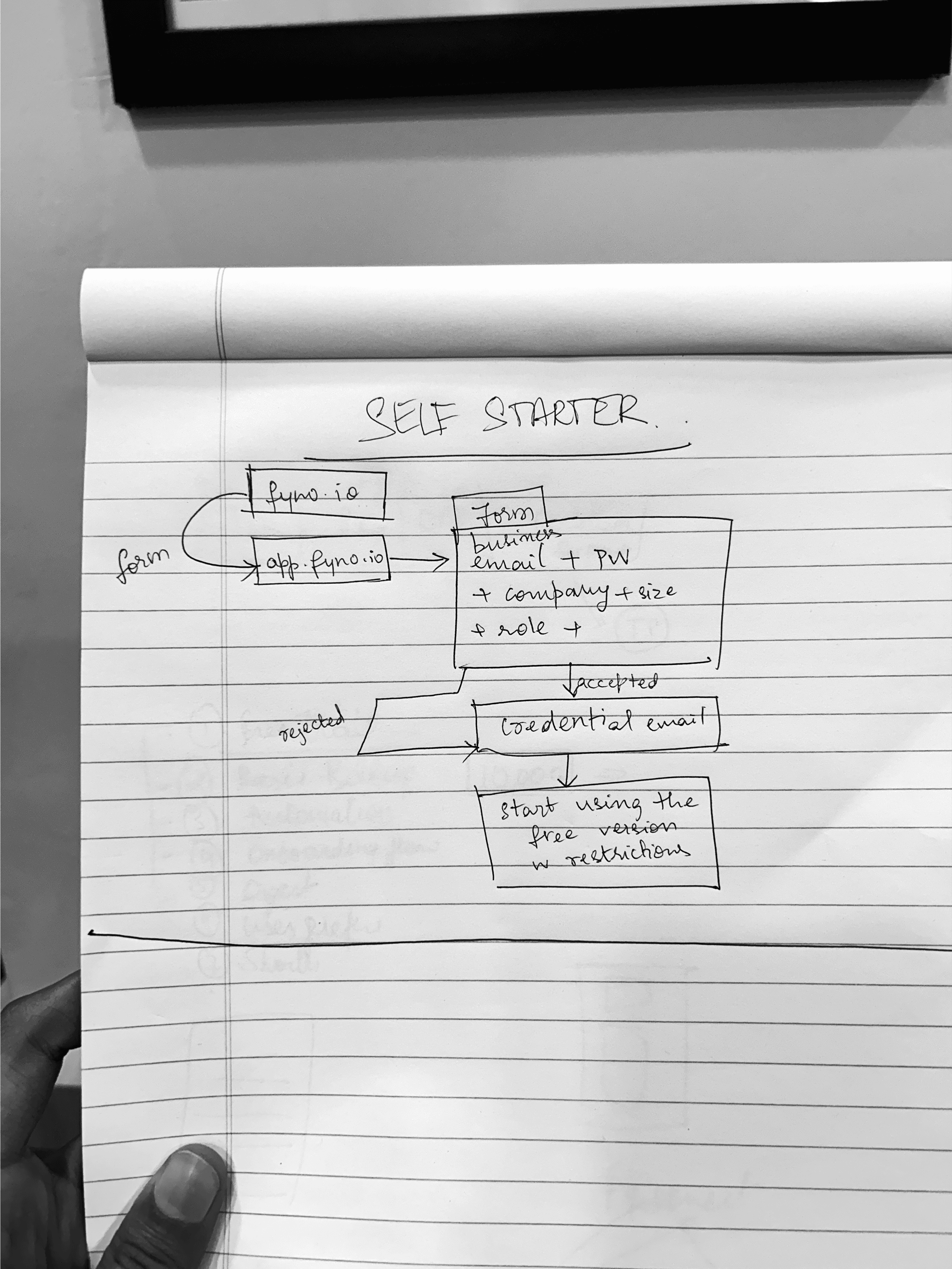
Created two contextual flows based on user roles:
Devs were routed into advanced features like the Workflow Builder
Business users were guided toward Campaigns, where they could upload CSVs and send bulk notifications with minimal config
The onboarding UI used a bottom-left guided panel (not modal) to reduce interruption while encouraging sequential exploration
Built-in demo data, inline tooltips, and placeholder configurations helped reduce fear of messing up

Outcome
We ran a controlled rollout to a subset of users and compared conversion and activation metrics to the legacy experience. Paired usability tests revealed better mental model alignment and improved confidence in finishing the flow. Designed a role-sensitive onboarding system rooted in context, not just UI polish.
Support team reported reduced time spent manually onboarding users
Business users found Campaigns earlier and activated sooner
New users reached first successful notification 30% faster
Post-launch data:
45% drop in onboarding-related drop-offs (Q1 vs Q2, 2023)
30% faster time-to-first-notification
25% fewer support tickets from new users
Internal teams adopted onboarding principles in other flows too
Takeaways
Onboarding isn’t a first feature—it’s often the last layer you design, but one of the most critical. Working on this project late in the MVP cycle helped me approach onboarding with clarity. We weren’t introducing a dashboard—we were introducing an entirely new way of thinking about notifications. That meant designing for trust, not just completion.
Future Scope
We imagined evolving the flow further:
Role-based personalization could get even smarter, surfacing the right features dynamically based on usage history
We also discussed embedding AI-powered guidance to recommend next steps as users scaled—from first notification to automation setup and retention analysis